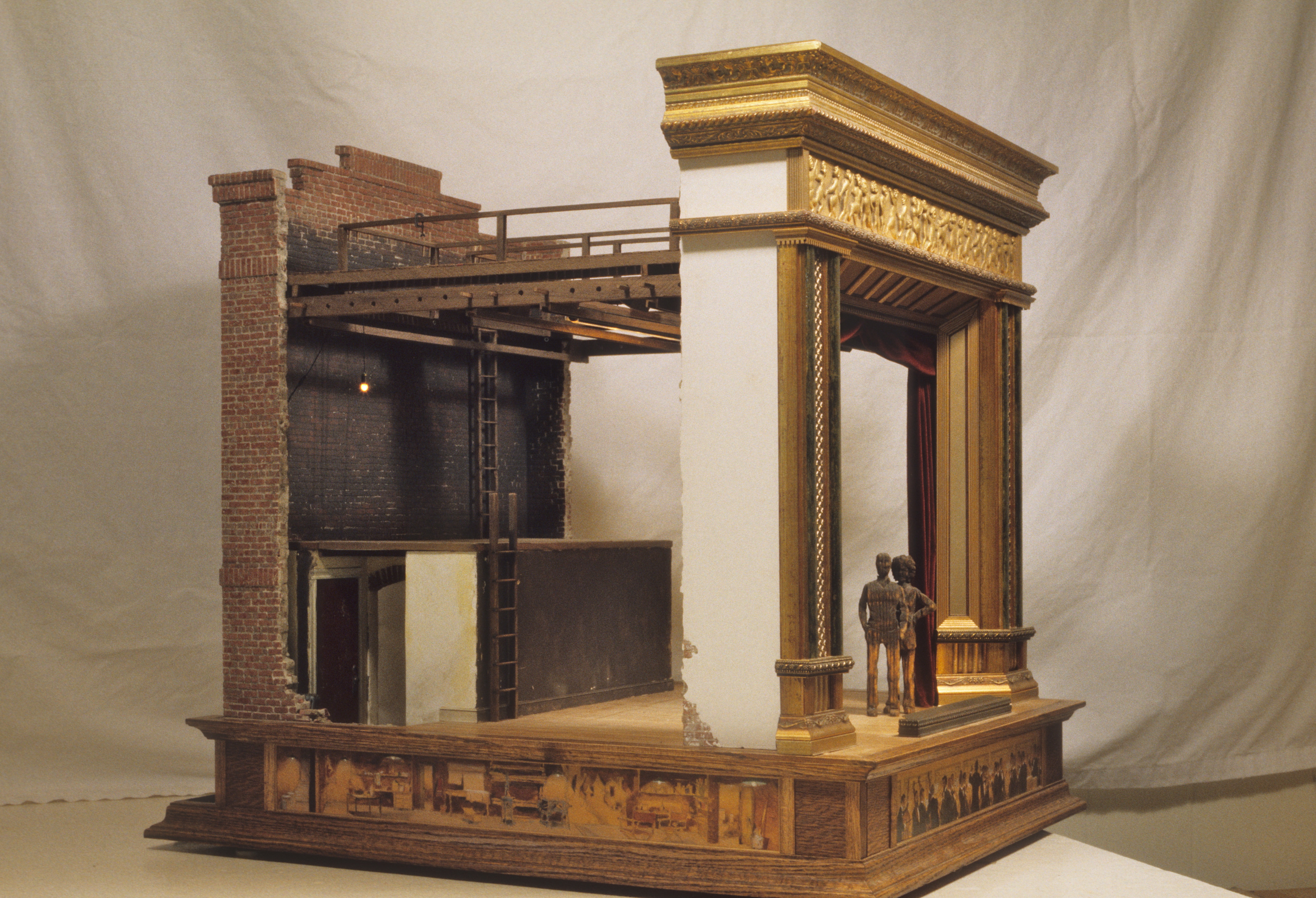
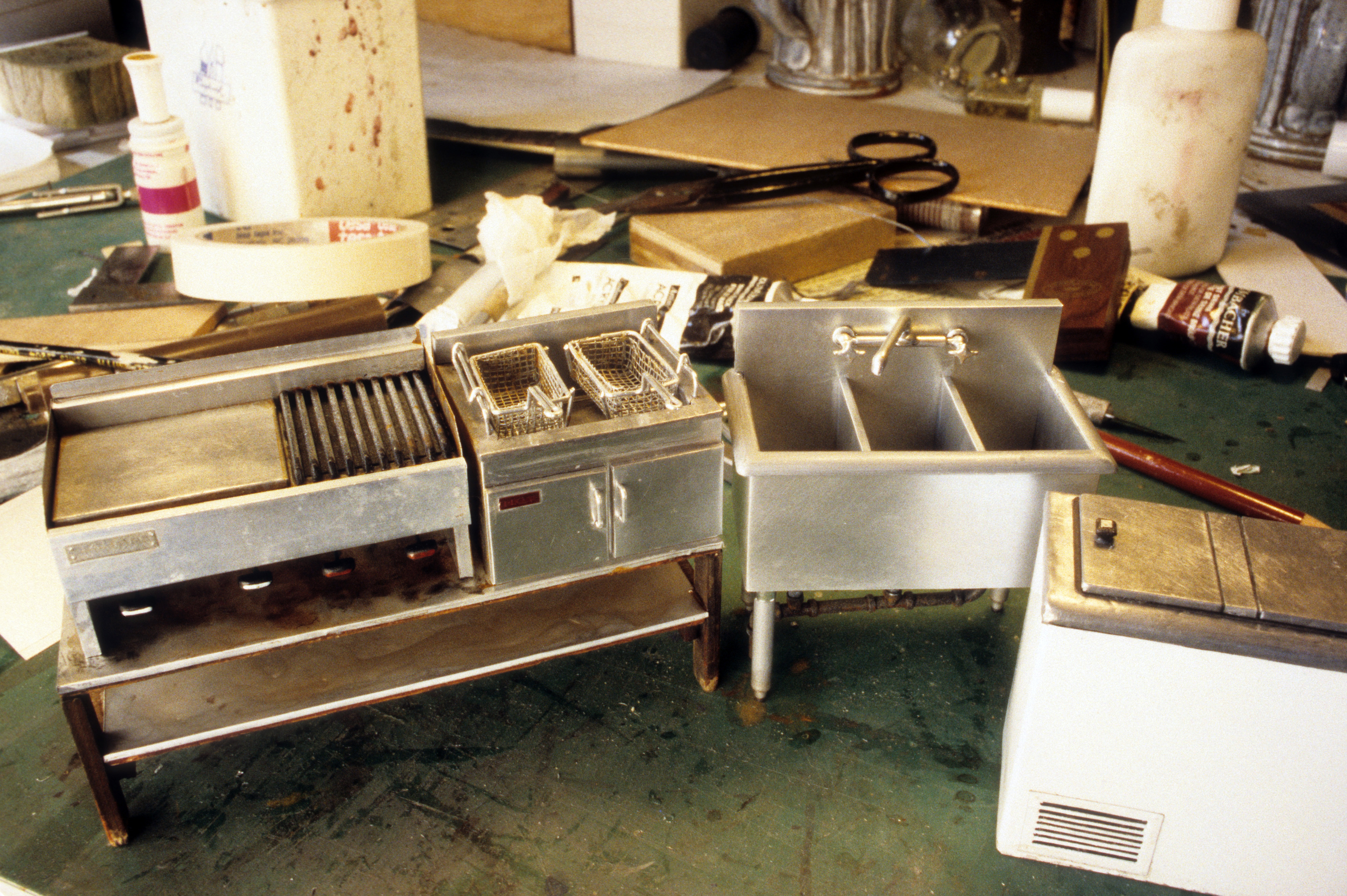
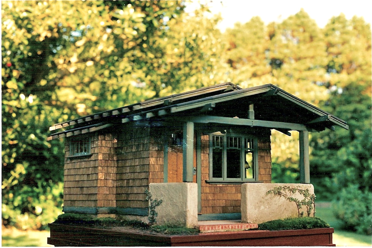
1994 Bungalow teaching project, currently residing at the National Museum of Toys & Miniatures in Kansas City
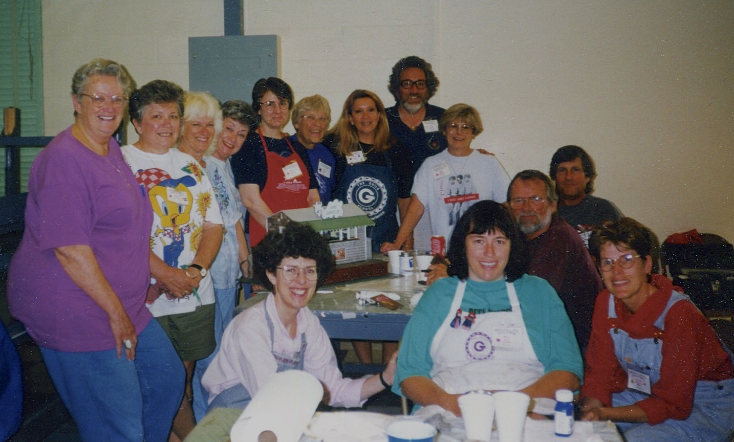
Our obsession with Charles & Henry Greene, and the Arts and Crafts Bungalow style, reached its finale in late 1994 when we started the Craftsman Bungalow teaching project. By then we’d been making miniature houses for twenty years, and teaching week-long techniques workshops for around fifteen of those. Most years we taught 3-4 times at various locations around the country, including our favorite, Castine, ME, home of the IGMA Guild School, and the amicable locals who liked to call us The Little People (we arrived with the lilacs–between the mud season, and the blackfly season). The School required we dream up a new class every couple of years, which was good, on the one hand, because it insured that both we and our repeat students would keep returning. On the other, it was a challenge to design something new that often. By ‘94 we had done nine different classes, many of which we kept in rotation, and what to do next loomed large.
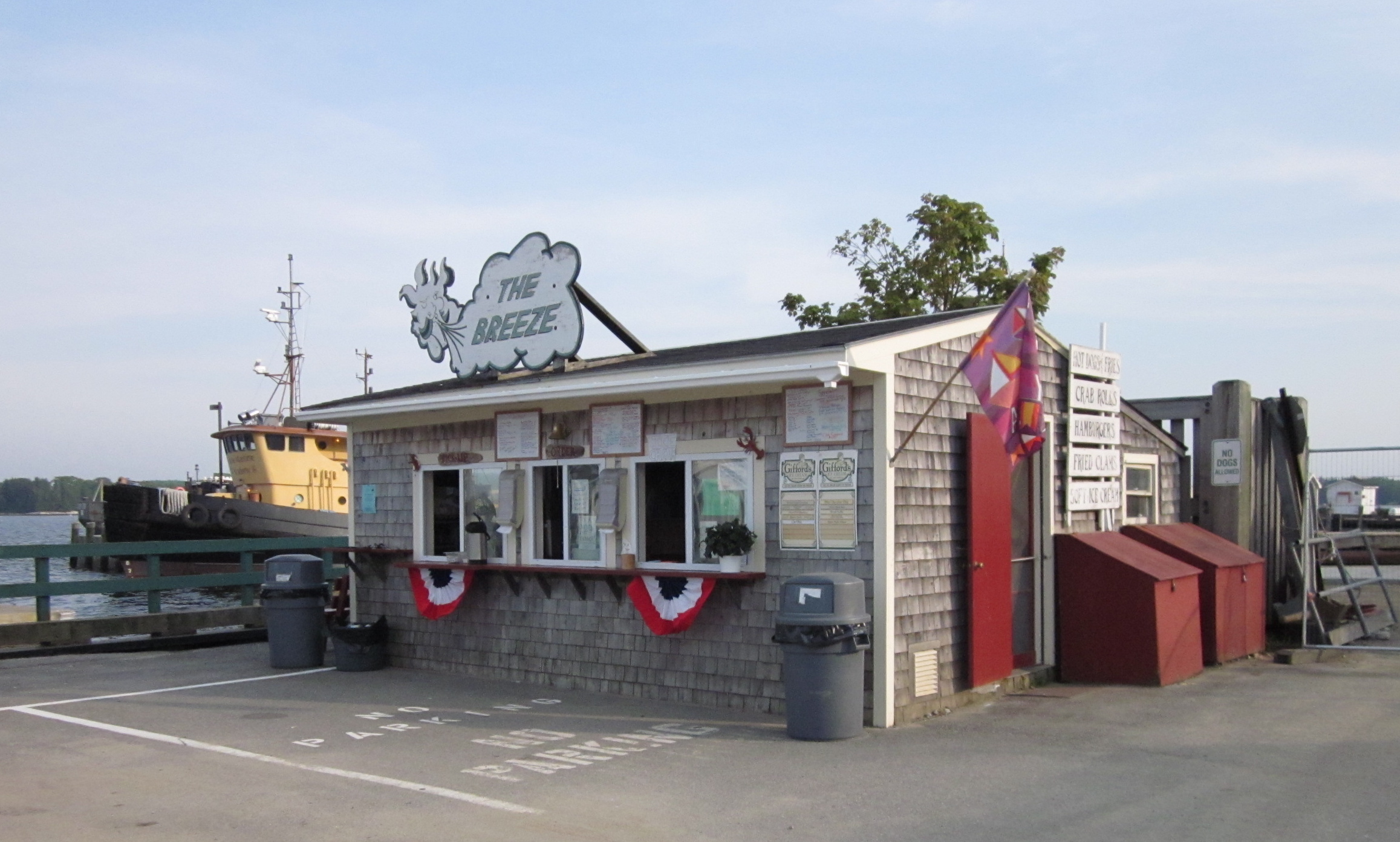
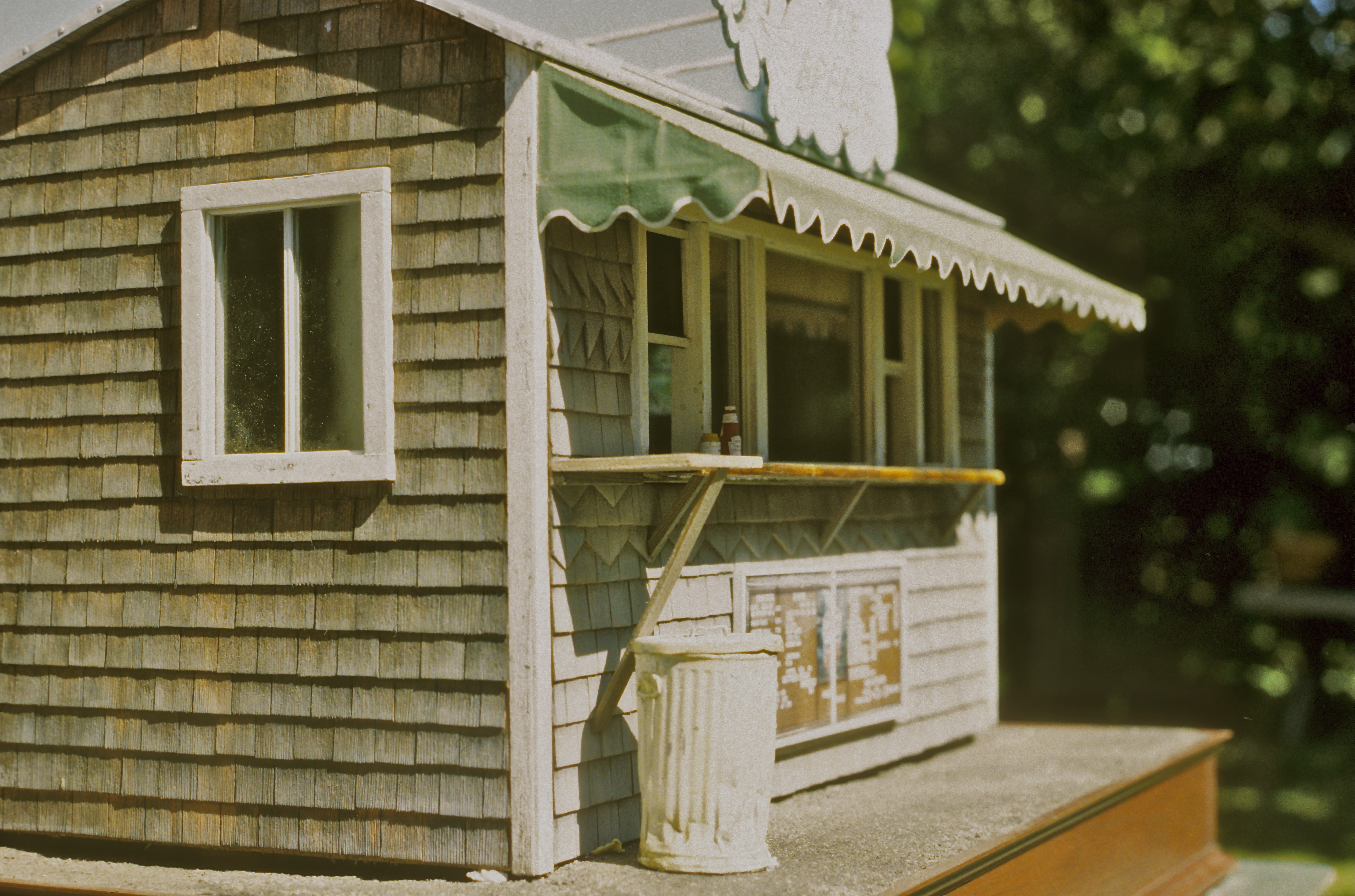
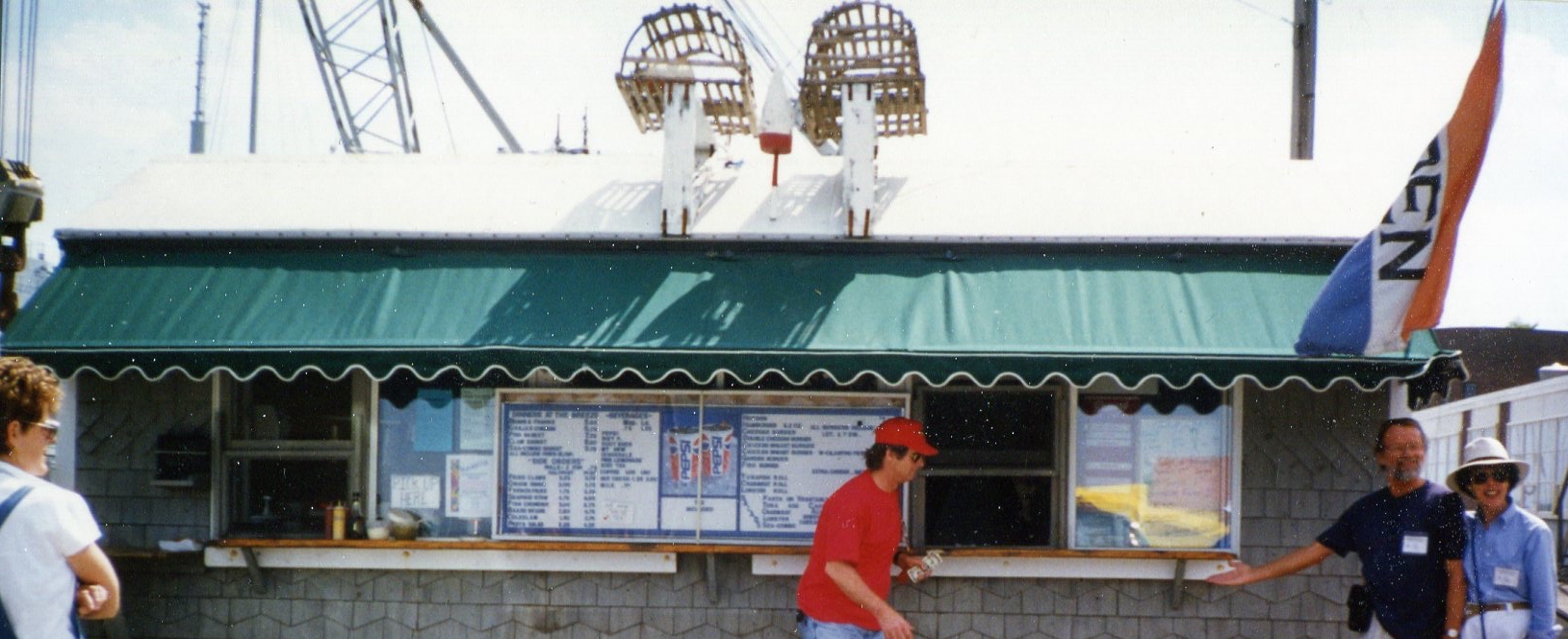
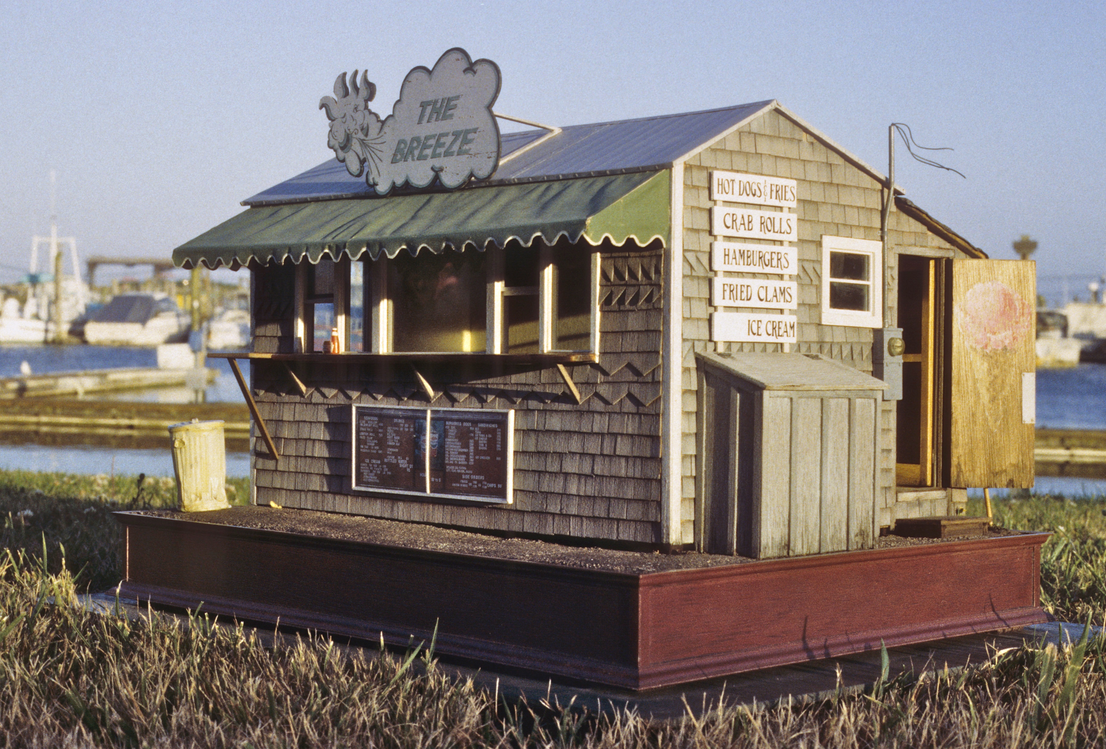
A little bungalow class was tempting, considering our love of the style, but teaching all that detailing felt like biting off more than we could chew. As it happened, one early morning in Ventura, CA, where we were teaching a workshop, we walked the beach to the newly restored pier. At the near end was a compact, well-conceived and executed Greene & Greene-inspired information center. A little gem. A sweetie of Greene-ish bungalow, and just the spur we needed to see that our favorite style could be hugely abbreviated and still maintain its integrity.
Besides being new and fun, a teaching project had to be doable in 5-6 days. It had to employ readily available materials, and, at the end of class, fit into a 20”X 15”X 15” shipping box for the student to take home. It also had to utilize new techniques, and look different from anything else we’d done. To keep it simple, we decided to make it a house fragment—a “house” containing just one room. Even though there was no time to teach interiors, we needed one for the prototype, to show the students what might be done. For ours we chose a living room. Because the Bungalow Era ushered in the notion of the living room (as being more “democratic” than the Victorian parlor), that was the natural choice. Noel then set out to design an overall, simple configuration for the exterior that would evoke the feeling of a whole house, as well as capture the underlying spirit of the style.

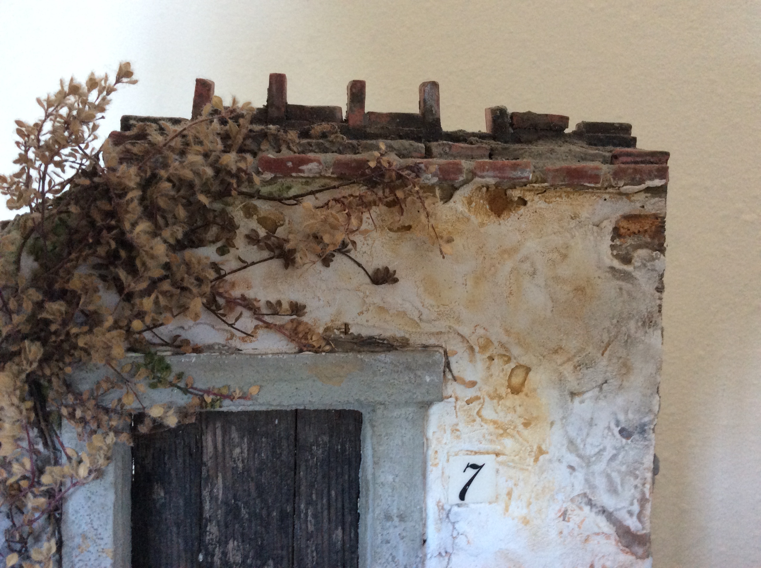
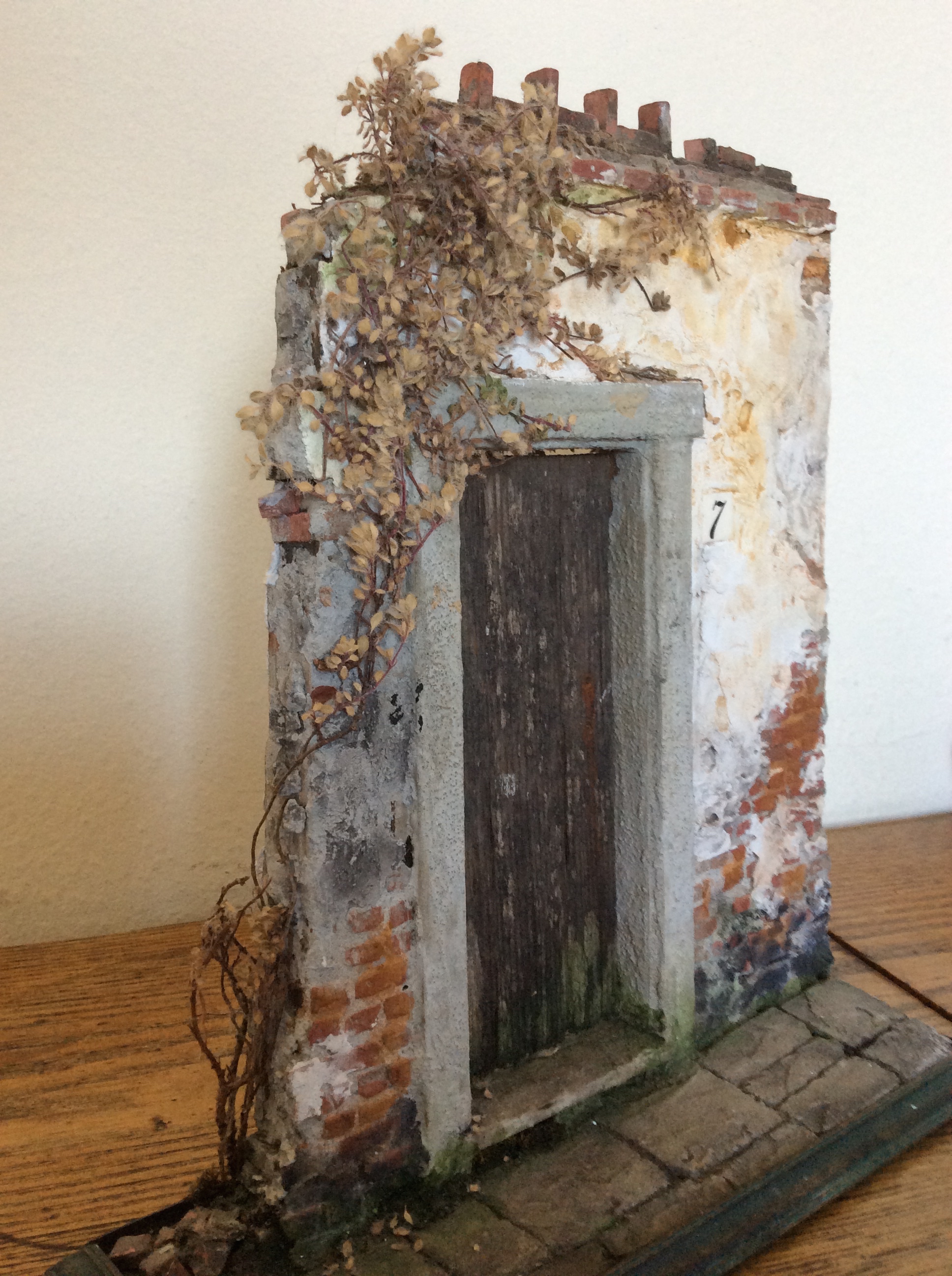
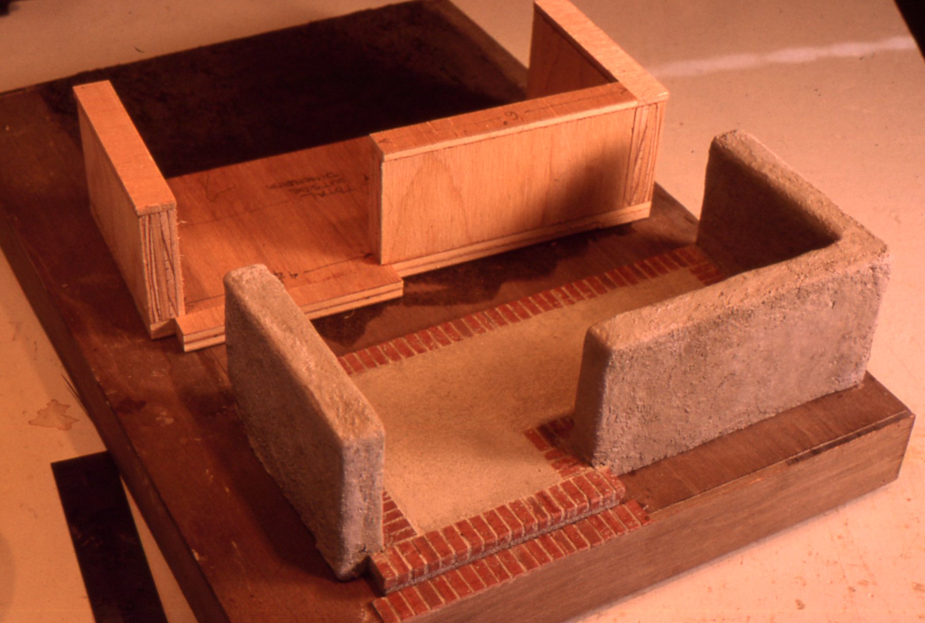
Before and after porch decks
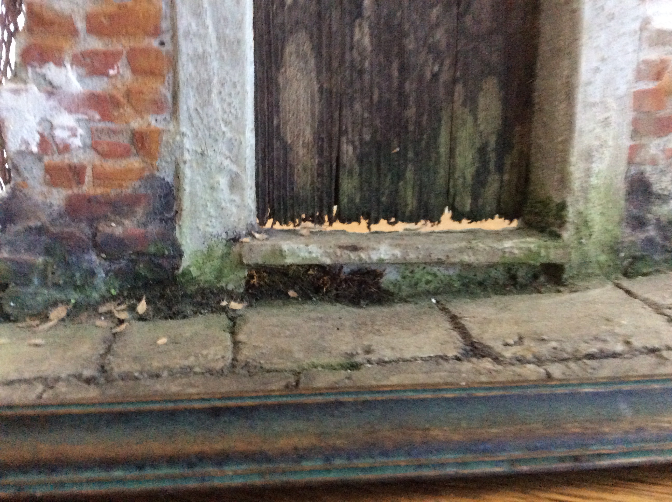
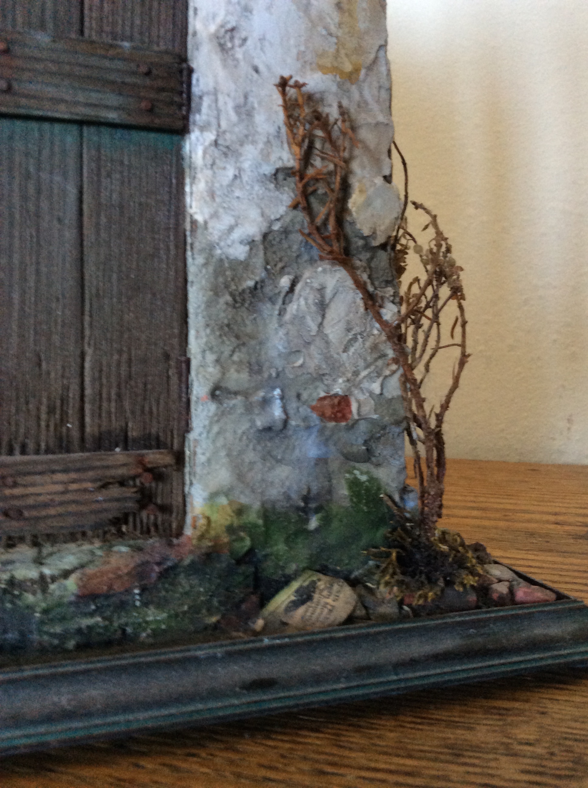
The essence of Bungalows is the harmony of textures, both visual and tactile, which became our next priority. One of the first elements we tackled was the cement (or “gunite,” which was cement sprayed on under pressure) base and porch. We made ours from Bondex Quick Plus Hydraulic Cement, a quick-drying patching cement available through builder’s supply stores in 3 lb. boxes, along with cement adhesive to hold it together.
To apply, we moistened a small batch of cement with a little water and a few drops of adhesive, mixing it with an old fork (not your favorite dinner flatware) in a small, disposable yogurt cup. We then spread it on the plywood porch walls and floor, quickly, with a putty knife. Noel then performed his magic, texturing the walls with his fingers, swirling and patting the cement as it (rapidly) dried. The aim is to have a thin, smooth surface overall.  The red brick trim on the top step—more texture and color—continues around the inner periphery of the porch floor, and needs to be applied and dry before the cementing process. Use a damp sponge to clean the cement off the brick. Timing, our Bungalow students will recall, is everything, especially in the case of spreading cement.

Creeping fig/thyme
To simulate the tiny-leaved creeping fig that grows along the Greene’s Gamble House porch, I used gray-green wooly thyme, a common ground cover I grew in the yard for that purpose (don’t forget, this is our third Greene & Greene project). The thyme retains its leaves and color best when dried for a few weeks in silica gel (a florist’s supply). After that, I touched up the color with undiluted Winsor Newton Sap Green tube watercolor, painted sparingly onto the individual leaves. Once they were dry, I cut the thyme into sprigs, and glued it to the cement with Elmer’s white glue. Yes, Elmer’s takes forever to dry, so I would apply a few pieces and hold them there until sticky enough to stay on the wall, then move on, checking back from time to time to give them a little push. In my experience, instant glues just attach your fingers to the wall. Plus, the Elmer’s gives the leaves and branches a little cushioning, so you don’t flatten, or break them in the process. The grass underneath is our usual Pacific Northwest moss, harvested from the dunes and glued to the dirt (real dirt) terrain.
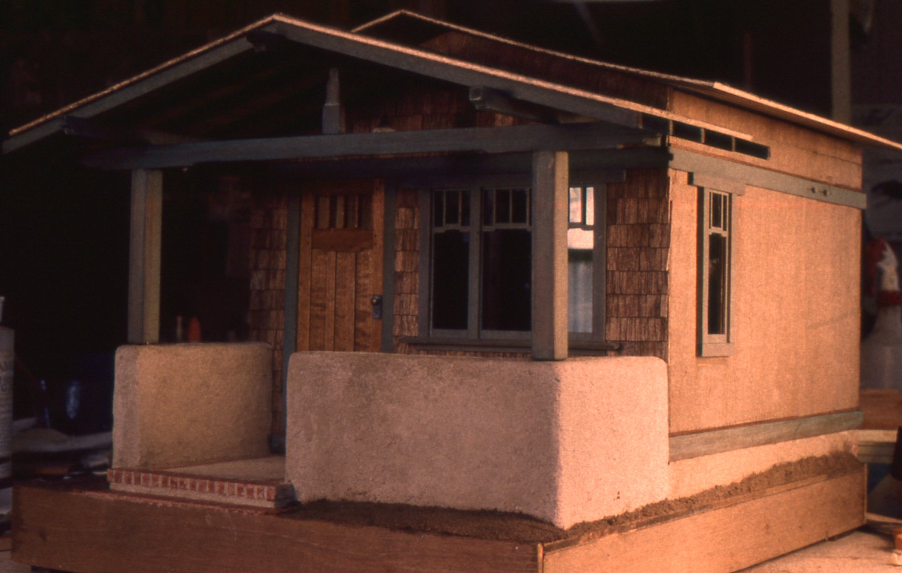
 The shingled siding was a major element in the design. The Greene’s weathered-shingle houses not only fit into the surrounding landscape, they seem to grow from it. We liked the way the houses of inland Pasadena weathered to an ash brown rather than the silver-gray we think of for coastal houses. To achieve this color on our mahogany shingles, we darkened them with Bug Juice before gluing them to the project. Once they were in place, and dry, we painted on a wash of 50/50 chlorine bleach and water, to both lighten the color, and further age the grain. Bleach also lends the wood a subtle greenish cast, which adds to the illusion of age. To further develop the aging, we lightly sanded the shingles (with a downward motion, only) with fine emery paper, then applied a final coat of full strength Bug Juice.
The base, house and porch trims—the exterior grid of supporting posts, beams, rafters and banding–are as visually weighty as the shingles. To achieve the signature Greene brothers’ green stain, Noel first cut the trims from fine-grained cedar, then rounded the edges of each piece slightly with emery paper. Rafter ends were angled on the table saw, and the outermost edges rounded. He then grayed all with Bug Juice, and let them dry. Next, he brushed on a very thin, transparent acrylic patina-green wash (a thin stain, with lots of water) of 4 parts Titanium White, 1 part Permanent Light Green, and 1 part Thalo Green). By “part” I mean a small squirt of acrylic tube paint, as directed, mixed in a jar with water until you have a transparent wash to paint on the wood. Less is more–it is best to start with a thin layer of wash, then re-apply as necessary. Our aim was to have the grayed cedar grain show through the color.

cloud lift
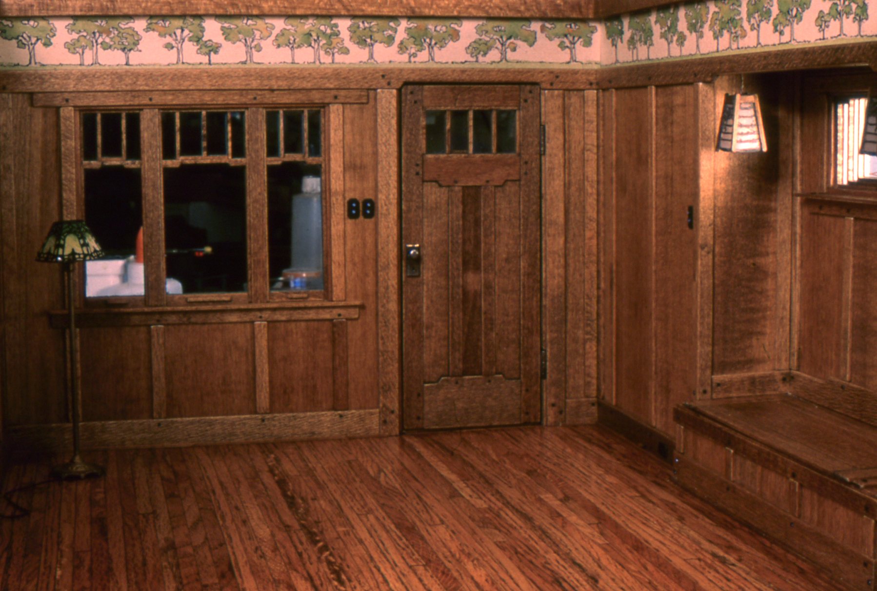
Two signature elements of the Greene’s style our students would need to make are the cloud lift, and the scarf joint. examples of these are found both inside and out. If you look closely at the photo above, you can see an example of the cloud lift (above the porch deck), and the scarf joint (about half way down the horizontal banding on the right wall).The best interior photo on our our version is in the upper horizontal banding, and inside in the picture molding opposite the inglenook, it is not only elegant and functional, but brilliantly conceived. The genius of this joint is that when the pegs (in full-size houses) shrink with age, and loosen, they continue to fasten the joint together. The balance of the long joint and the pegs’ wiggle-room allows some give, so when the earth trembles and heaves, the joints can glide without breaking.

scarf joint
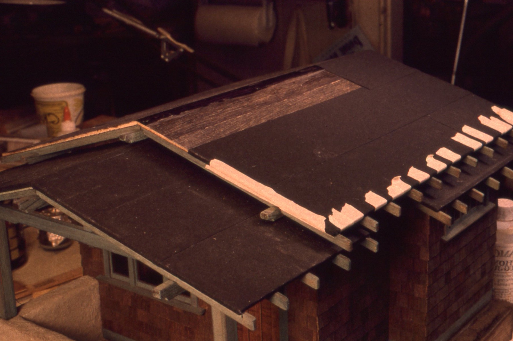
The black composition roll roofing provides yet another texture and color. For this we used fine emery cloth, a tricky-to-work-with but ultimately satisfactory substitute material. The tricky part is when the black grit wants to lift off on your wet hands, leaving bare blue patches where the paper shows through.  To simulate roll roofing, we cut the cloth in 3” wide strips, then laid it face down on fresh newspaper to apply Elmer’s glue. The glue is dripped on, then rubbed carefully over the entire back of the strip, enough to meet the edges, but not leak around them to the grit side. I then pressed the strips in place on the roof with dry, clean fingers, starting at the bottom edge of the roof, wrapping the edges of the cloth around the roof edges. At first the emery paper is stiff and difficult to work with, but you will find it soon reaches a pliable stage from the penetration of the glue, as well as the warmth of your hands. It’s a crucial time, as that is also when the surface is most likely to start disintegrating. Working my way up the roof, I overlapped the strips by ¼.” You can also “tar” the edges with right-from-the-tube Mars Black acrylic paint.

Rolled roofing in progress, edges taped down with masking tape while drying.
My familiarity with the grittiness of rolled and tarred roofing comes out of my heedless post-college summers in New York, rooftop sunbathing under the smoggy skies of the 60s. Not only did the sky pepper my skin with cinders and ash, but the sticky tar beneath softened in the heat and glued lumps of itself to me and my bathing suit.
To age the roof, we made a milky-dirty wash of water, Titanium white, and a little raw umber, all Grumbacher tube acrylics. One method is to apply this mix gingerly (once the glue is completely dry), with a foam brush. It’s tricky, as the cloth quickly reaches a stage of saturation where the grit comes off on the brush. Alternately, one can use the brush for the edges and under the eaves, and apply the rest sparingly from a spray bottle, allowing each application to dry fully before applying the next. This being a residential structure, the end result should be muted—just enough to take the ‘new” out of the black surface.

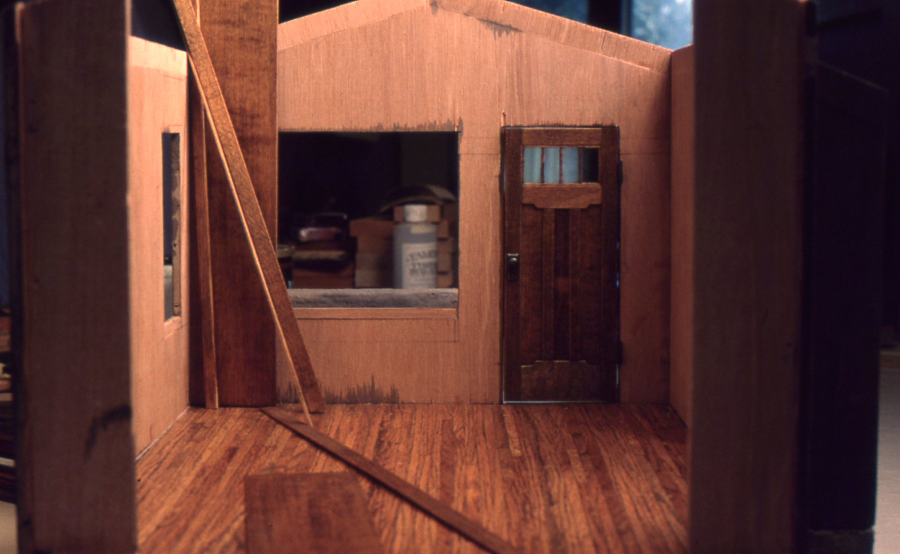
Interior in progress
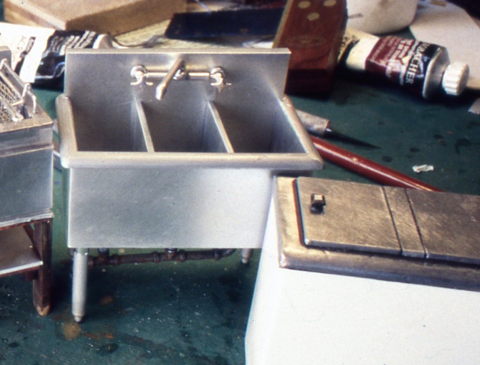
The detailing of the Craftsman interior was a labor of love—Noel’s. Once again, I was amazed at how much light and subtle texture the Greens worked into their stained, hardwood interiors. Noel’s job was to translate the original materials and craftsmanship into miniature terms. As with the originals, he was able to cut flooring from oak, ripping 1/16″ X 3/16” floorboards from our cache of full-size oak flooring. He then laid the individual strips with Elmer’s, and when the glue was dry, hand-sanded the floor and stained it with McClosky’s Tungseal transparent Light Oak stain. When the stain was fully dry, smoothed the wood further with 0000 fine steel wool, and applied a coat of McClosky’s Dark Oak, which he then wipes off with a paper towel and allowed it to dry. Finally, he applied Johnson’s paste wax by hand, and buffed it with a soft cotton cloth. (Note: McClosky’s is no longer available—a real loss for miniaturists and cabinetmakers alike).

Note the inglenook to the right, with the windowseat lid open.
The rest of the woodwork is basswood, instead of the fine hardwoods of the originals. If you buy enough basswood stock, you can find almost any grain you want to stand in for hardwoods. This he finished with the same method as the flooring. A trademark Greene & Green feature is the use of ebony pegs to fasten the paneling. For these Noel used a dyed-through black paper—in this case a cover sheet from a pad of tracing parchment, which he cut with an X-acto knife, and glued to the wood’s surface. I think the pegging makes the room—it’s such a subtle yet elegant detail that the viewer discovers along the way.

Note the light switches to the left of the door.
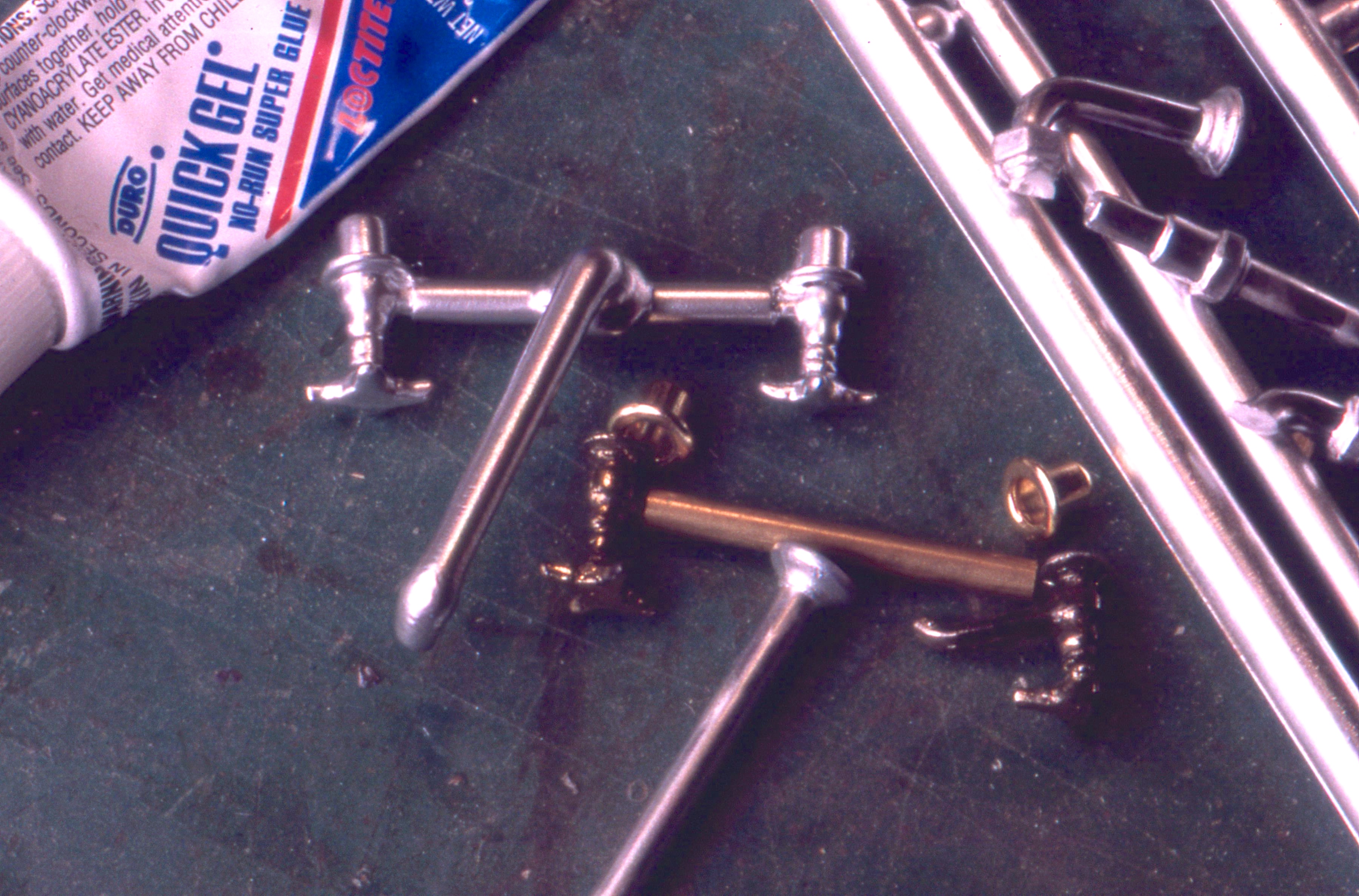
Another killer interior Greene detail is the ebony baseboard outlets, and light switch covers with Mother-of-pearl push buttons, made from modified Metal Miniatures covers. Noel trimmed the corners, sprayed it all flat black, and used pearlescent nail polish for the buttons.
The Craftsman wallpaper frieze (at the top of the walls) Noel designed by combining stencil patterns from a period reproduction book—The Craftsman, an Anthology, ed. by Barry Sanders, 1978, Peregrine Smith, Inc.

Original frieze painting.
He drew his repeat tree design on the back side of strips of old wallpaper (for its surface texture and time-yellowed color), and colored them with watercolors. He started with 3-4 trees on a sample strip, and asked what I thought—great, I said, and so fast! So fast we decided he could teach that in class as a bonus for the students. Then he began the step and repeat for real, enough to go all around the room, which took a lot more time than planned.

Frieze applied before trims.
More than just repeating a tree design, it was about maintaining spacing, anticipating how the pattern would change at the corners of the room, and keeping the colors consistent, so no one tree stood out from another. Once he drew in enough to band the whole room, we photocopied the design for the students to then trace back onto wallpaper. Neither way was an easy process, but the end results gave the room another subtle boost, a little more warmth.

Finished interior. Bridge lamp is by the Kummerows. Noel built the hanging fixtures from opalescent glass, photo-etched brass, and basswood
With this little house–our fond farewell to the ghosts of Charles & Henry Greene, et al–we and our students found that even a little Greene & Greene is a lot–a lot of work, but also a lot to enjoy. Their houses have been called “art as architecture” and, like a good painting, book, or piece of music, can be savored again and again. And, we were set for teaching for another couple of years, and could take a breather. Or so we thought…